
Customizing Form Filter Selection Boxes
Customizing Form Filter Selection Boxes
Related Pages
Developer page
Model Background
Pseudo Fields
This page explains how to populate and style the filter selection boxes (dropdowns) in mDIS forms.
Introduction
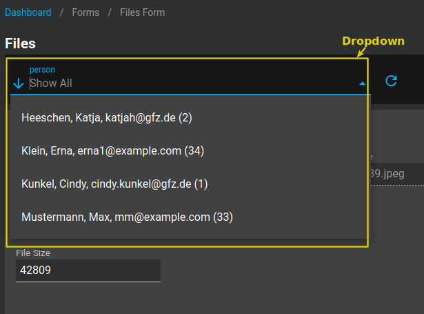
Form filter selection boxes (dropdowns) at the top of mDIS forms allow users to filter data by selecting values from related entities. For example, in a files form, users can filter by the person who uploaded the file. This documentation explains how to customize these filter selection boxes by implementing the getFormFilters() method in your model classes.
Key Concept
By default, filter selection boxes are populated based on the relationships defined in your model JSON file, specifically this section:
"relations": {
    "archive_file__contact_person__curator_contact_person_id__1n": {
        "displayColumns": [
            "person_acronym"
        ],
        "model": "ContactPerson",
        "value": "id",
        "text": "filter_text",
        "ref": "curator_contact_person_id"
    }
}
However, you can override this behavior by implementing the getFormFilters() method in your model class.
To do so, override the getFormFilters() method in your model class, which defines how related data should be displayed in dropdown menus. This method returns an array configuration that tells the system how to query and format the filter options.
Basic Implementation
The getFormFilters() Method
The getFormFilters() method should be implemented as a static method in your model class. It returns an array where each key represents a filter name, and the value is a configuration array.
Basic Implementation Example
This file models/ArchiveFile.php is an empty class by default. When you add an override, it will look like this:
<?php
// File: backend/models/ArchiveFile.php

namespace app\models;

class ArchiveFile extends \app\models\base\BaseArchiveFile
{
    public static function getFormFilters() {
        return [
            "person" => [
                'model' => 'ContactPerson',
                'value' => 'id',
                'text' => 'person_acronym',
                'ref' => 'curator_contact_person_id'
            ]
        ];
    }
}
Configuration Parameters
Each filter configuration supports the following parameters:
| Parameter | Type | Description | Example |
|---|---|---|---|
model | string | The name of the related model class | 'ContactPerson' |
value | string | The field used as the option value (usually ID) | 'id' |
text | string | The field (column name) or SQL expression for display text | 'name' or SQL expression |
ref | string | The foreign key field in the current model | 'curator_contact_person_id' |
Advanced Text Formatting
Using SQL Functions
You can use SQL functions and expressions to create formatted display text:
public static function getFormFilters() {
    return [
        "person" => [
            'model' => 'ContactPerson',
            'value' => 'id',
            'text' => 'CONCAT(COALESCE(last_name, ""), ", ", COALESCE(first_name, ""), ", ", COALESCE(email_1, ""), ", ", COALESCE(person_acronym, "")," (id: ", id, ")")',
            'ref' => 'curator_contact_person_id'
        ]
    ];
}
This example creates display text like:
"Doe, John, john.doe@example.com, JD (id: 123)"
Handling NULL Values
Use COALESCE() to handle NULL values gracefully:
'text' => 'CONCAT(COALESCE(last_name, "Unknown"), ", ", COALESCE(first_name, ""))'
Multiple Filter Types
You can define multiple filters for different relationships:
public static function getFormFilters() {
    return [
        "person" => [
            'model' => 'ContactPerson',
            'value' => 'id',
            'text' => 'CONCAT(last_name, ", ", first_name)',
            'ref' => 'curator_contact_person_id'
        ],
        "project" => [
            'model' => 'Project',
            'value' => 'id',
            'text' => 'name',
            'ref' => 'project_id'
        ],
        "status" => [
            'model' => 'FileStatus',
            'value' => 'id',
            'text' => 'status_name',
            'ref' => 'status_id'
        ]
    ];
}
Form Template Integration
JSON Template Configuration
By default, the following is set by the mDIS template manager.
The form template JSON file must reference the filter configuration:
{
    "name": "files",
    "dataModel": "ArchiveFile",
    "filterDataModels": {
        "person": {
            "model": "ContactPerson",
            "value": "id",
            "text": "filter_text",
            "ref": "curator_contact_person_id"
        }
    }
}
Important
When using getFormFilters(), the text field in the JSON template is typically ignored because the SQL expression in the PHP method takes precedence. However, keep the JSON structure for compatibility.
API Endpoints
Filter Lists API
The getFormFilters() method is used by the filter-lists API endpoint:
GET /api/v1/form/filter-lists?name=files&models=[{"model":"person","require":null}]
Response:
{
    "person": [
        {"value": 1, "text": "Doe, John, john.doe@example.com (1)"},
        {"value": 2, "text": "Smith, Jane, jane.smith@example.com (2)"}
    ]
}
Main Form API
Filtering uses the standard Yii2 REST syntax:
GET /api/v1/form?name=files&filter[curator_contact_person_id]=33
Processing / Translation into SQL happens in backend/models/core/SearchModelTrait.php.
Troubleshooting
Common Issues
- No options in dropdown: Check that the
modelclass exists and has data - SQL errors: Verify field names exist in the database table
- Display text not formatted: Ensure SQL syntax is correct in the
textparameter - Filtering not working: Verify the
refparameter matches the foreign key field name
Debugging
Enable database query logging to see the generated SQL:
// In your development environment
Yii::$app->db->enableLogging = true;
Yii::$app->db->enableProfiling = true;

or use Yii .env variables and configuration files (`backend/config/web.php`):
Testing Filter Configuration
Test your filter configuration with curl:
curl -H "Authorization: Bearer YOUR_TOKEN" \
  "http://localhost:8080/api/v1/form/filter-lists?name=files&models=[{\"model\":\"person\",\"require\":null}]"
Best Practices
- Use COALESCE() for NULL-safe concatenation
- Include ID in display text will always be sent in SQL
OR clausefor filtering - Keep text concise while providing enough information
- Test with real data including edge cases (NULL values, special characters)
- Use consistent formatting across related forms
- Document complex SQL expressions with comments
Customizing Filter Selection Box Styling
Frontend Component Styling
You can customize the appearance and layout of filter selection boxes by modifying Vue.js components and adding custom CSS. This involves editing the frontend component files in the src/components/ directory.
Adding ID Attributes for Styling
To apply specific styles to filter elements, add an id attribute to the relevant HTML/Vue element:
Example: Adding ID to Filter Container
<!-- File: src/components/DisFilterForm.vue -->
<template>
  <v-layout row wrap pl-1>
    <v-flex id="filter-select-top"
        v-for="(item, key) in dataModels"
        :key="key"
        :md="(key === 'person' ? 4 : 2)"
        :lg="(key === 'person' ? 4 : 2)"
        sm4 xs12 pa-1>
      <v-autocomplete
          ref="filter"
          :rules="fieldRules"
          :loading="loading"
          clearable
          :items="cascadeListItems[key] ? ..."
          :label="key"
          <!-- ... other attributes -->
      />
    </v-flex>
  </v-layout>
</template>
Custom CSS Styling
Add custom CSS in the <style> section of your Vue component:
<style>
.c-dis-form__filter-form {
  width: 100%;
}

#filter-select-top {
  min-width: 50%;
}

/* Additional styling examples */
#filter-select-top .v-autocomplete {
  margin-bottom: 16px;
}

#filter-select-top .v-input__control {
  min-height: 48px;
}

#filter-select-top .v-select__selection {
  font-weight: 500;
}
</style>
Common Styling Patterns
Responsive Width Control
#filter-select-top {
  min-width: 50%;
  max-width: 100%;
}

@media (max-width: 768px) {
  #filter-select-top {
    min-width: 100%;
  }
}
Custom Filter Box Appearance
#filter-select-top .v-autocomplete .v-input__control {
  background-color: #f5f5f5;
  border-radius: 8px;
  border: 1px solid #e0e0e0;
}

#filter-select-top .v-autocomplete.v-input--is-focused .v-input__control {
  border-color: #1976d2;
  background-color: #ffffff;
}
Dropdown List Styling
/* Style the dropdown options */
.v-autocomplete__content .v-list-item {
  padding: 8px 16px;
  min-height: 40px;
}

.v-autocomplete__content .v-list-item:hover {
  background-color: #f0f0f0;
}

.v-autocomplete__content .v-list-item--active {
  background-color: #e3f2fd;
  color: #1976d2;
}
Vue.js Component Structure
The filter form components are typically structured as follows:
<!-- File: src/components/DisFilterForm.vue -->
<template>
  <v-layout row wrap align-center>
    <!-- Help component -->
    <help class="help-pos" reltLink="guide/viewer-operator/#_1-files-form"/>

    <!-- Main filter form -->
    <v-flex md12 lg7 xl8>
      <v-form ref="form">
        <v-layout row wrap pl-1>
          <v-flex id="filter-select-top"
              v-for="(item, key) in dataModels"
              :key="key"
              :md="(key === 'person' ? 4 : 2)"
              :lg="(key === 'person' ? 4 : 2)"
              sm4 xs12 pa-1>
            <!-- Autocomplete component for each filter -->
            <v-autocomplete
                ref="filter"
                v-model="dataModel[key]"
                :items="cascadeListItems[key]"
                :label="key"
                <!-- ... other props -->
            />
          </v-flex>
        </v-layout>
      </v-form>
    </v-flex>
  </v-layout>
</template>
Vuetify Component Customization
When working with Vuetify components like v-autocomplete, you can customize various aspects:
Grid Layout Properties
<v-flex
  :md="(key === 'person' ? 4 : 2)"    <!-- Medium screens: person=4 cols, others=2 cols -->
  :lg="(key === 'person' ? 4 : 2)"    <!-- Large screens: same as medium -->
  sm4                                   <!-- Small screens: 4 columns -->
  xs12                                  <!-- Extra small: full width -->
  pa-1>                                 <!-- Padding: 1 unit -->
Autocomplete Properties
<v-autocomplete
  :rules="fieldRules"                   <!-- Validation rules -->
  :loading="loading"                    <!-- Loading state -->
  clearable                             <!-- Show clear button -->
  :items="cascadeListItems[key]"        <!-- Options list -->
  :label="key"                          <!-- Field label -->
  item-text="text"                      <!-- Display field -->
  item-value="value"                    <!-- Value field -->
  dense                                 <!-- Compact height -->
  outlined                              <!-- Border style -->
  hide-details="auto"                   <!-- Hide validation messages when valid -->
/>
Best Practices for Styling
- Use semantic IDs: Choose descriptive IDs like
filter-select-toprather than generic names - Responsive design: Ensure filters work well on mobile devices
- Accessibility: Maintain proper contrast ratios and focus indicators
- Consistency: Use the same styling patterns across similar components
- Performance: Avoid complex CSS selectors that might impact rendering performance
Testing Style Changes
After making styling changes, test the filter appearance:
- Different screen sizes: Check responsive behavior
- Multiple filter types: Ensure all filter types look consistent
- Interaction states: Verify hover, focus, and active states
- Browser compatibility: Test in different browsers
Development Workflow
When customizing filter styling, work in the development environment with hot-reload enabled (npm run serve) to see changes immediately. Always test the final build to ensure styles are applied correctly in production.